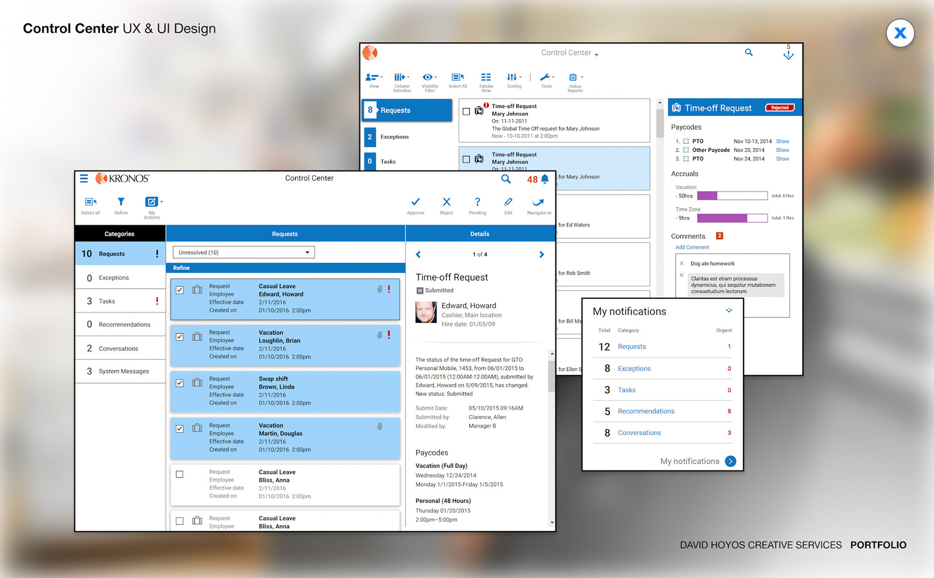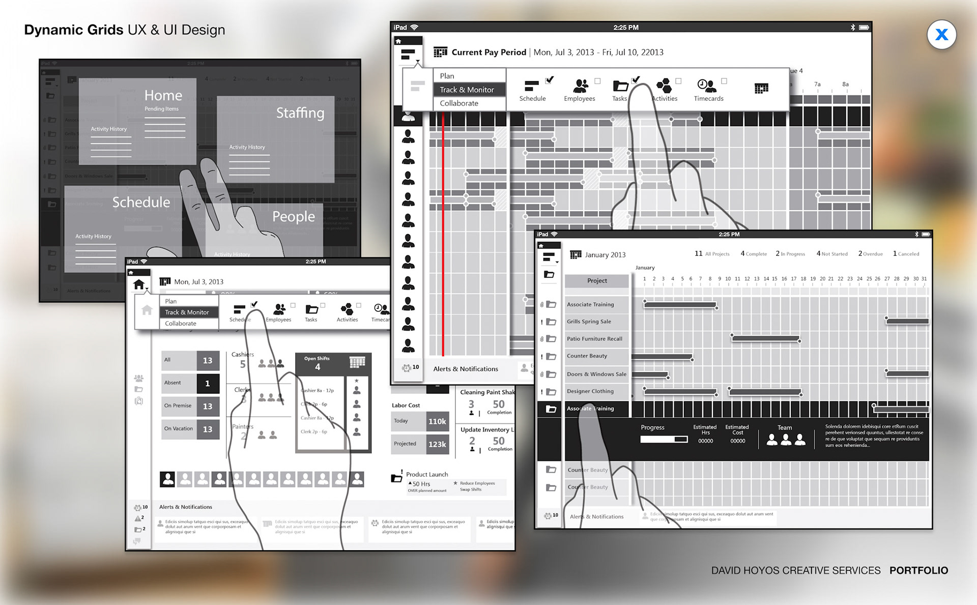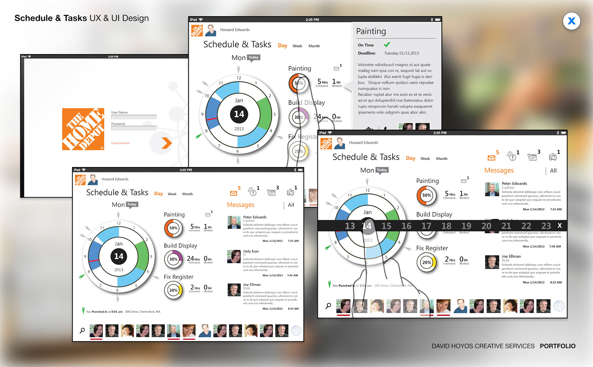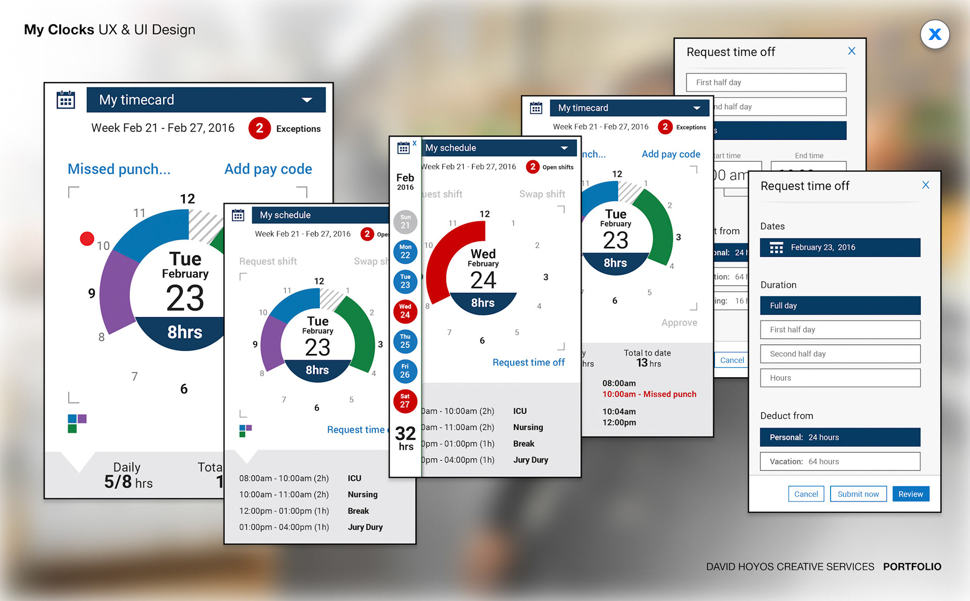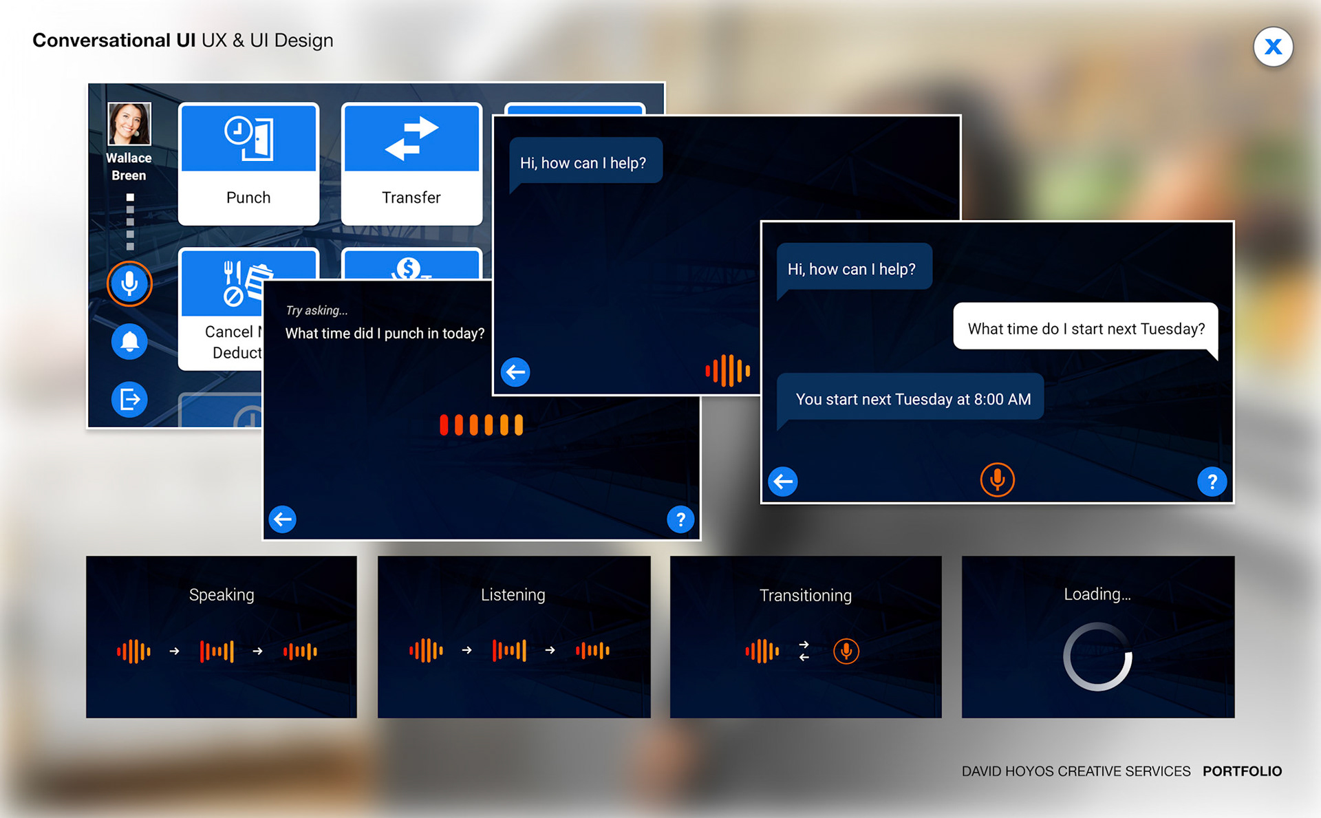
Sirius — Next-Generation Data Collection Device
Integrated Hardware & Software Design for Enterprise Field Operations
Overview
Most enterprise device design works within fixed hardware specifications, the software adapts to a form factor that has already been decided. Sirius inverted that dynamic entirely. This was a project where the physical device and the digital interface were designed simultaneously, from the ground up, with neither allowed to constrain the other prematurely. The result is a data collection device where the hardware form and the software experience were built to the same standard and read as a single, intentional thing.
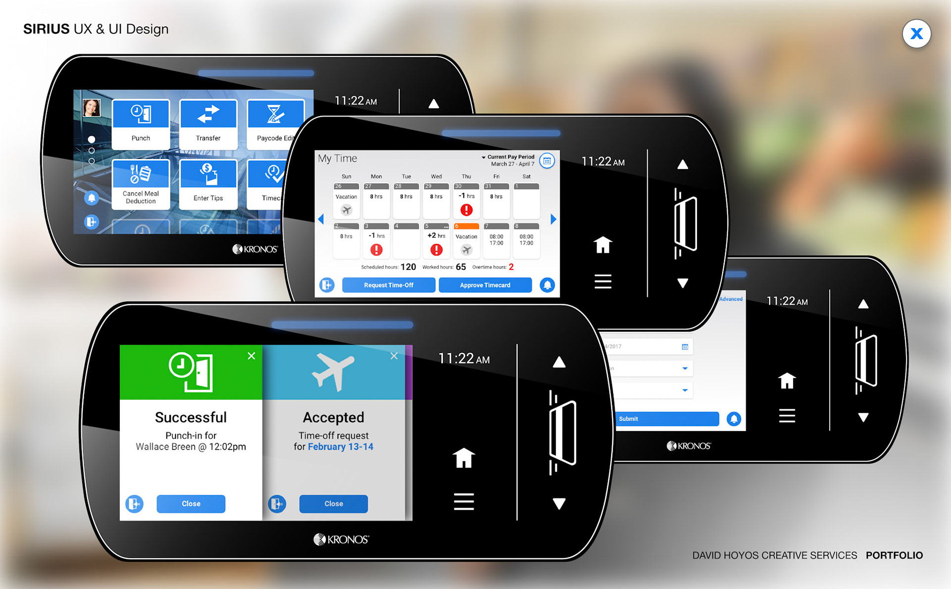
The scope was total: ergonomics and physical form factor, high-resolution touchscreen interface, performance architecture, and a voice command system powered by natural language processing that extended interaction beyond touch entirely.
The Challenge
Three constraints defined the design problem and had to be resolved in parallel.
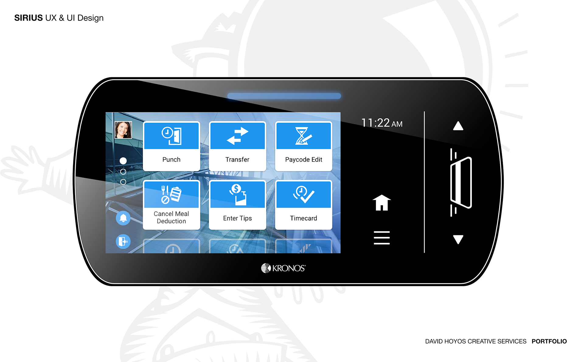
Form factor was the most complex because Sirius was being designed from scratch, which meant the physical dimensions of the device were as much a design variable as the layout of the software. A device too large to hold during extended use fails regardless of how good the software is. A device too small to accommodate the required touchscreen area constrains the UX from the outside. Resolving this required iterating on physical proportions and digital wireframes simultaneously, with each discipline informing and constraining the other in real time.
Vertical space introduced a different problem. A data collection device operates in portrait orientation, often at arm's length, in environments where glanceability matters as much as information depth. Every screen state had to be designed with the assumption that the user had limited time and limited attention.
Data density was the third constraint. Transactions on a data collection device involve product codes, quantities, prices, locations, timestamps, and status fields, all of which a user may need to see, enter, or verify in a single workflow. Presenting that on a small touchscreen without overwhelming the user required a disciplined hierarchy of what was primary, what was secondary, and what lived behind demand.
Approach
The process moved through Assessment, Exploration, Design, Production, and Deployment with the critical difference that hardware and software decisions ran on the same track throughout.
Assessment mapped how data collection was being done across four industries: what devices were in use, where they were failing, and what users needed that existing products weren't providing. The consistent findings, hardware built for durability but uncomfortable for extended use, interfaces designed for function without attention to usability, and zero integration of voice interaction in a category where hands-free operation had real operational value became the design brief for Sirius.
Exploration tested hardware form factors and software interaction architectures in parallel. A front-end developer and software architect were present throughout this phase, making technical feasibility for hardware integration and software rendering a real-time conversation rather than a late-stage discovery. Decisions that would have been expensive to revisit after engineering committed were made collaboratively while the cost of change was still low.
The Work
Wireframes on a project like this had to resolve two overlapping sets of decisions simultaneously, the structural logic of the software experience across transaction and management workflows, and the spatial and proportional constraints the hardware had to satisfy to make that software work as intended. The wire phase produced dual specifications: a coherent software architecture and a hardware design envelope derived directly from it.
High-fidelity designs translated those structural decisions into the complete visual and interaction language of the device, touchscreen UI, visual treatment of voice command states across all interaction modes, and the hardware design language that gave the physical form its identity.
BuildKit delivered the full implementation specification to engineering: component states, animation behaviors, voice interaction flows, hardware integration specs, and asset exports organized for both software and hardware development teams. Not a handoff, a complete build package designed to protect design intent through production.
The Outcome
A product where the physical object and the digital interface reinforce each other rather than competing. Sirius delivered durability, ergonomics, interface sophistication, and voice interaction in a product category where trade-offs between those qualities had previously been accepted as inevitable.
Staying close through production and deployment was as critical as setting the direction during exploration because the gap between a well-designed spec and a well-built product is where quality is most often lost.
Role — Creative & Design Direction (UX/UI) Team — UX · UI · Research · Front-End Developer · Software Architect · Product Management Industries — Retail · Manufacturing · Healthcare · Hospitality
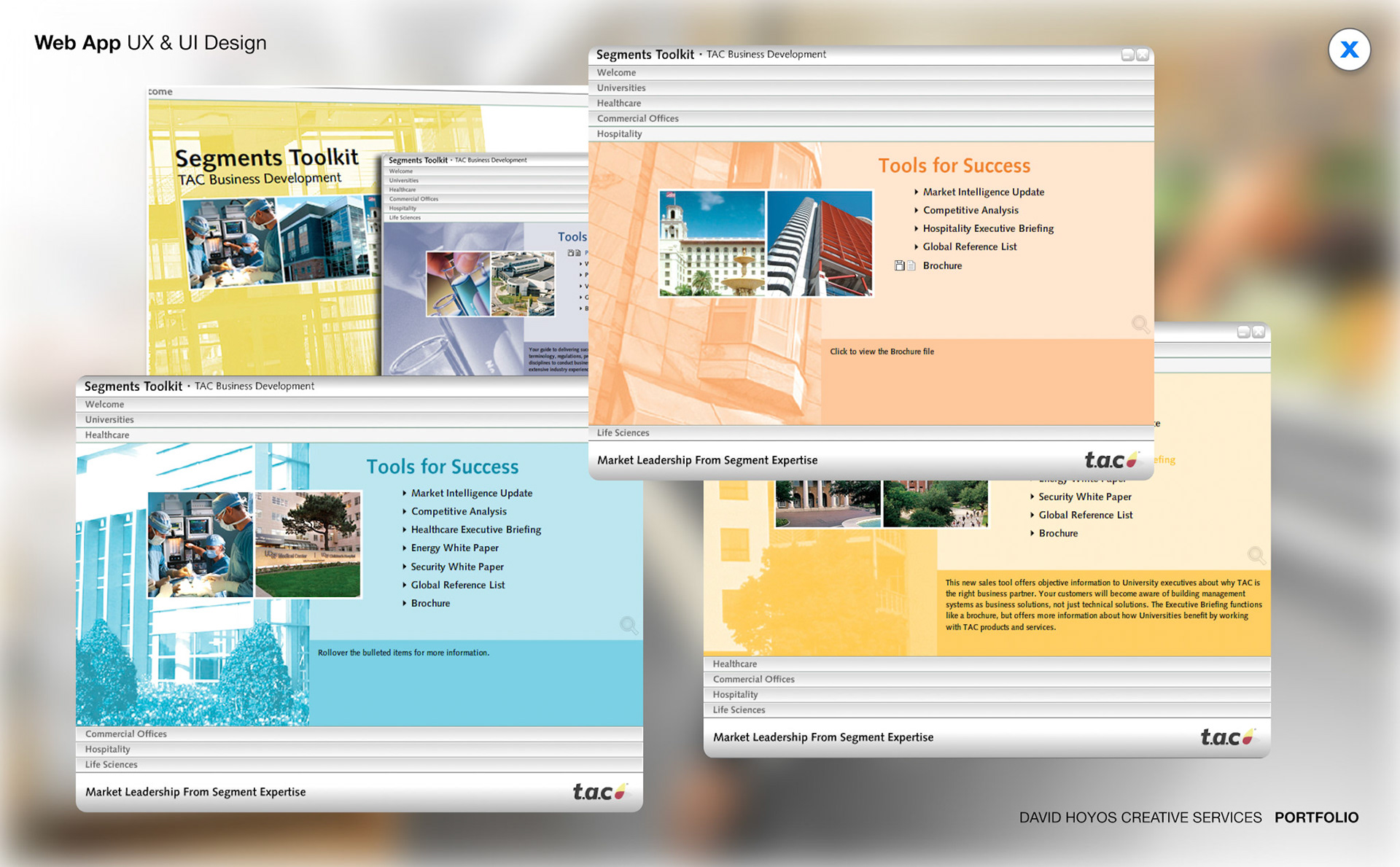
SaaS Product Design Strategy
Enterprise Platform Transformation — Legacy On-Premise to Modern Cloud SaaS
Overview
This project represents one of the most consequential design challenges in enterprise software: taking a mature, on-premise product suite and rebuilding the entire experience for the cloud. Not a visual refresh. Not a feature update. A complete rethinking of how a product serves real people across five industries, three distinct user types, and an organization that had spent years building around tools that technically worked but quietly exhausted everyone who used them.
The Challenge
The legacy platform had been built over many years by multiple teams solving problems in isolation. The result was a product that carried inconsistent patterns, redundant flows, and a visual language that reflected a different era of software. Moving to SaaS introduced an entirely new set of user expectations, the speed and responsiveness of a modern web product combined with the configurability that enterprise buyers had come to depend on.
The harder challenge was human. Aligning cross-functional teams around a shared design vision, when every product area had developed its own conventions and its own sense of ownership, required earning trust through process before earning buy-in through output.
Approach
The process moved through six structured phases. Assessment, Exploration, Research, Prototype, Iterations, and Deployment, designed to reduce risk while moving decisively through ambiguity.
Discovery started with a full audit of the legacy product: cataloging interaction patterns, mapping friction points, and aligning stakeholders on what success actually looked like before any design work began. Research followed not as a checkbox, but as an ongoing practice. User interviews and contextual inquiry sessions with managers, full-time employees, and hourly workers shaped every significant decision that came after.
Prototyping kept the cost of learning low. Low and mid-fidelity concepts were tested early, before commitment hardened. High-fidelity work came only after the core interactions had been validated. Each iteration closed the gap between what the product was and what it needed to become.
The Work
Rather than delivering screens, the output was infrastructure, a design foundation built to outlast the project itself.
A Design System became the shared language for every team building on the platform: not just what components looked like, but how they behaved, when to use them, and why. A system that teaches you how to think, not just what to copy.
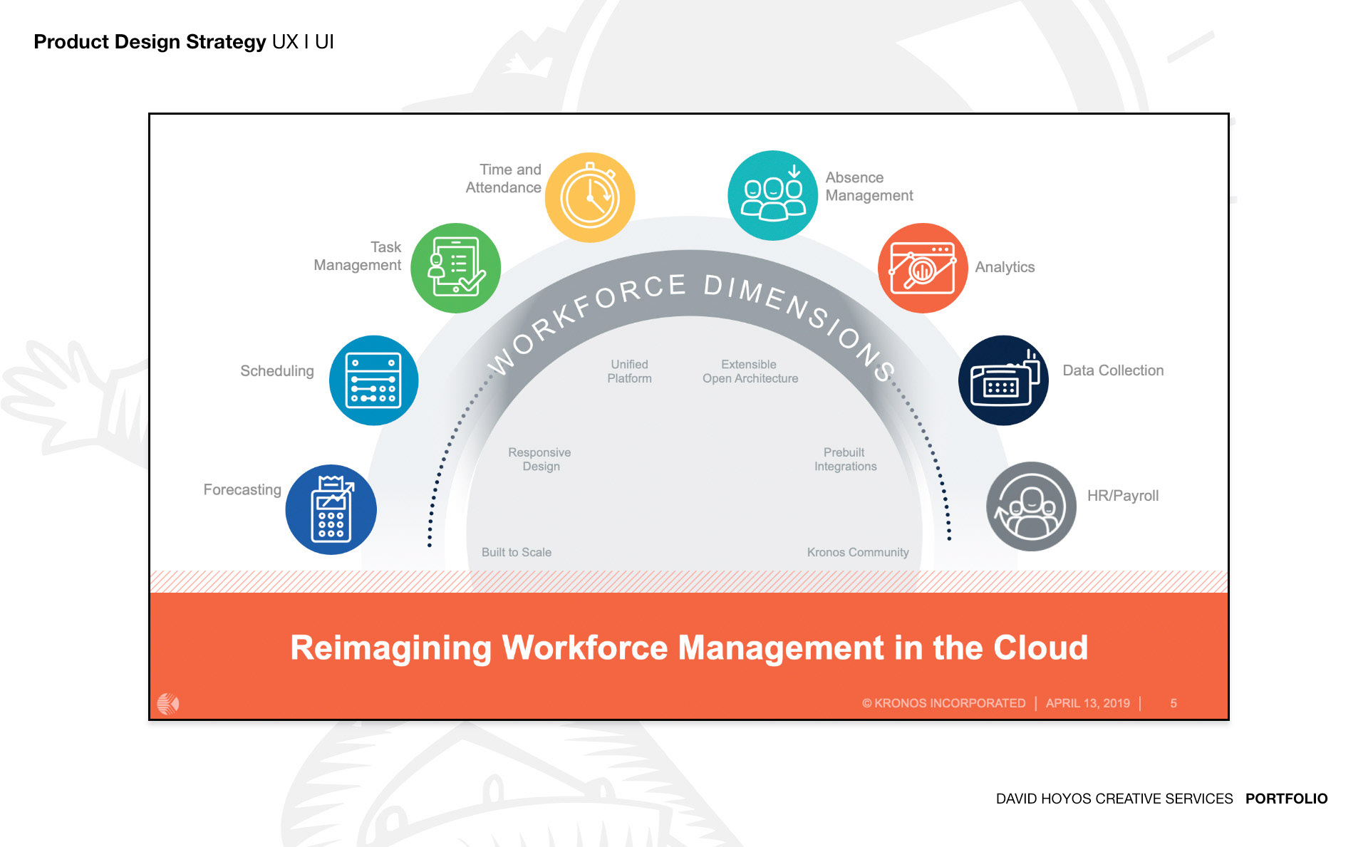
Common Components were designed to be flexible across five industry contexts, retail, manufacturing, healthcare, HR, and hospitality, while remaining consistent enough to build genuine familiarity across the product.
Design Tokens defined the core visual values at the code level, allowing changes to propagate systemically rather than manually and making the platform extensible for themes, brand variations, and future products without breaking the underlying structure.
The Outcome
A platform that felt native to five industries without being built five separate times. A design system that gave distributed teams the tools to make good decisions independently. And a product experience that measurably reduced onboarding friction, shortened the learning curve for new users, and helped the business retain and grow within accounts, not just launch.
Strategy without execution drifts. Execution without strategy fragments. Holding both together was what made this work.
Role — Design Leadership & Execution Team — UX · UI · Research · Product Management Industries — Retail · Manufacturing · Healthcare · HR · Hospitality
Apple Watch App
Native Wearable Experience for Workforce Management
Overview
What does it mean to design for a screen the size of a postage stamp that lives on someone's wrist? This project explored that question within a workforce management context, and the answer required stepping back from conventional app design entirely. This was not about shrinking an existing mobile experience onto a smaller display. It was about identifying which moments in an hourly worker's shift genuinely benefit from a glance-and-go interaction, and then designing those moments with a level of precision that most software never demands.
The native Apple Watch app was purpose-built to complement the broader scheduling platform, functioning as a real-time assistant that surfaces the right information at the right moment without requiring the employee to stop what they are doing, reach for their phone, or navigate through multiple screens.
The Challenge
Two constraints defined every decision.
The first was the form factor. The Apple Watch screen is small by design, and that constraint is not just visual. It shapes how information can be organized, how interactions must be sequenced, and how much context a user can hold in a single view. Standard UI patterns from mobile and web simply do not translate. Navigation hierarchies that feel effortless on a phone become exhausting on a watch. Every design decision had to pass through a single filter: what is the one thing this person needs to know right now, and how do we show only that?
The second constraint was the dependency on the iPhone. The Apple Watch relies on a paired device for data connectivity, which means the experience is subject to Bluetooth reliability, background refresh limitations, and physical proximity. Designing for a device that is occasionally out of sync with its data source required building graceful states for stale content, clear last-updated indicators, and interaction patterns that did not frustrate users when connectivity was momentarily unavailable.
There was also the harder problem of information redundancy. The goal was not to duplicate what already lived on the mobile app but to identify the specific subset of information that gains real value by being on the wrist. Getting that distinction right required careful research and a willingness to cut features that seemed useful in theory but added noise in practice.
Approach
Assessment began with an audit of how hourly employees were actually using the existing mobile app. Usage data, support tickets, and direct interviews revealed a consistent pattern: the most accessed features were shift times, break schedules, and manager messages. Everything else was secondary. That finding became the foundation for the entire wearable strategy.
Exploration focused on what watchOS could do that mobile could not, rather than mapping mobile screens to watch screens. The team investigated how haptics, complications, and Siri integration could create genuinely new interaction moments, from ambient shift countdowns displayed as watch face complications to voice-activated status check-ins that required no visual attention at all.
Design translated the strongest concepts into structured flows. At this screen size, wireframes were as much about content priority as visual layout. Deciding what appeared on the primary card, what lived one swipe away, and what required a tap involved constant negotiation between completeness and clarity.
Production ran in close collaboration with the front-end developer and software architect throughout, because watchOS has its own layout engine and rendering behavior. Staying in sync with engineering from an early stage was the only way to ensure design intent survived the technical constraints of the platform.
The Work
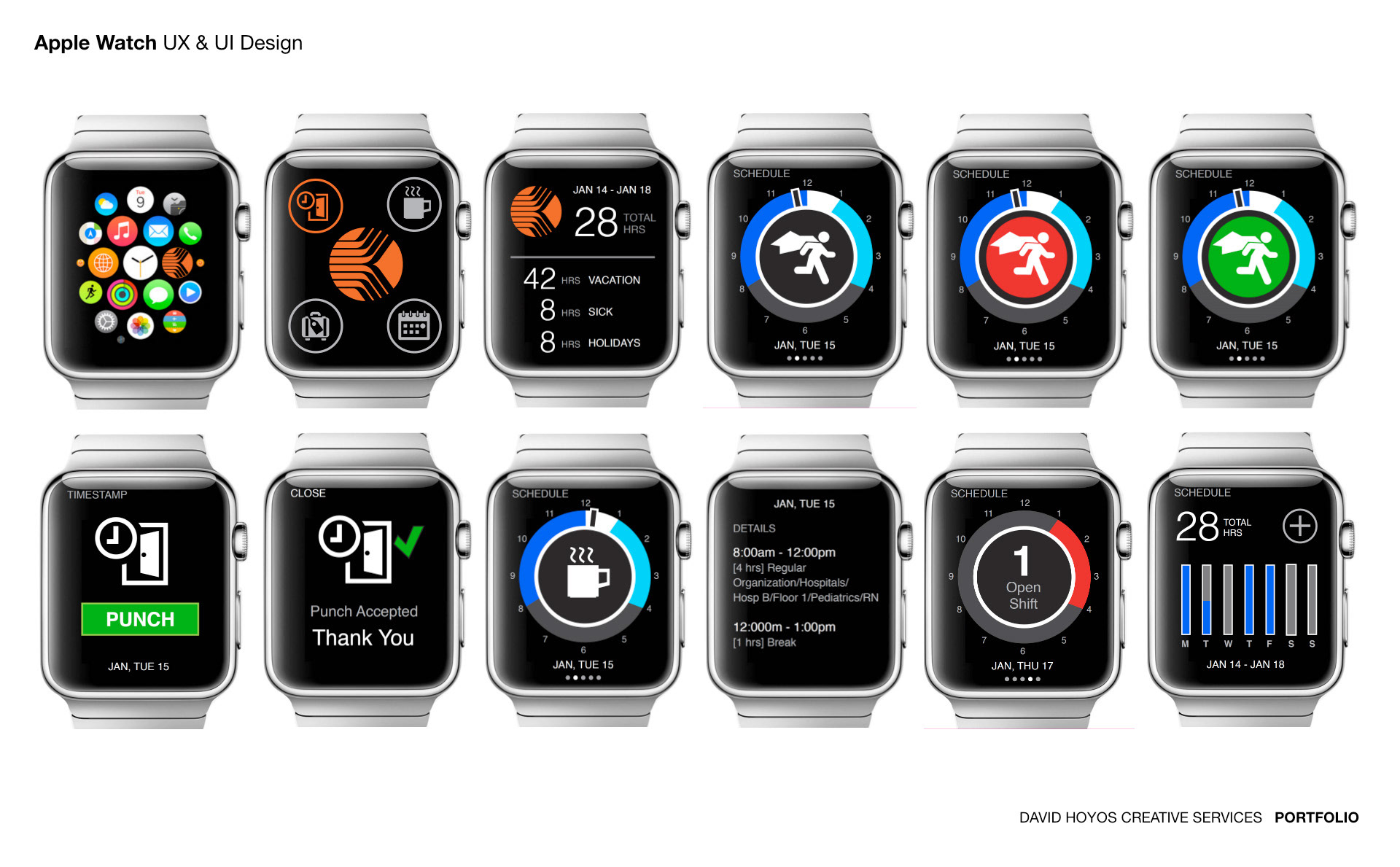
Wireframes played a more critical role here than in most projects. Because screen real estate was so constrained, low-fidelity explorations were used to stress-test content hierarchy and interaction logic before any visual decisions were made. A wireframe that could not communicate the right thing in the right order at the right time was not going to be rescued by color or typography.
High-fidelity designs brought the visual language of the broader platform into the watchOS context, adapted to the constraints of a small, always-on display. This included detailed work on dark mode optimization, since the Apple Watch OLED makes dark interfaces not just visually appropriate but functionally superior for battery life and legibility. Typography choices, icon sizing, and layout density were all validated against real device previews rather than simulator estimates.
BuildKit and Design System documentation served as the connective layer between design and engineering, covering spacing, component behavior, interaction states, and animation timing in a format the development team could reference independently. Given the precision required by watchOS layout constraints, clear specs were a prerequisite for shipping a product that matched the design intent, not a formality.
The Outcome
A wearable experience that fits naturally into the rhythm of a shift without adding cognitive load. Retail associates, warehouse workers, and hospitality staff get shift times, break windows, task assignments, and real-time manager updates in under two seconds, on a device they never have to reach for. Haptic feedback replaces audio alerts in loud environments. Voice input replaces touch when hands are occupied.
The broader outcome was establishing the wearable as a legitimate productivity surface within the platform ecosystem, one that increased engagement with the scheduling system by lowering the barrier to access.
Role — Design Leadership and Execution Team — UX · UI · Research · Front-End Developer · Software Architect · Product Management Industries — Retail · Manufacturing · Hospitality
AI–Driven Rapid Prototyping
Acme Onboarding Sprint (5 Days)
Overview
Acme, a Series A B2B SaaS workforce management platform, had a measurable problem: 68% of new users were abandoning the product during Account Setup, and only 32% were reaching activation against an industry benchmark of 58%. The support team was fielding 15 or more tickets per week from users who could not get through the same three steps. The product worked. Getting people into it did not.
This was a 5-day sprint engagement to redesign the onboarding flow from Welcome through Account Setup, Team Invite, and First Task, and deliver a tested, handoff-ready prototype by end of day five.
The Challenge
The core friction was structural, not visual. Account Setup presented eight required fields before a new user had seen a single piece of product value. There was no progress indicator. Team Invite was treated as mandatory by the interface even though the back-end did not require it, which created a wall that 41% of users who made it past Account Setup still did not clear. On mobile, the drop-off rate climbed to 74%.
The real insight, confirmed through cohort data from the lead engineer, was that users who reached First Task showed three times higher 30-day retention than those who did not. The product had a defined activation moment. The onboarding flow was actively preventing users from reaching it.
The constraints were tight: no new back-end API changes, no new components outside the existing design system, and the redesigned flow had to work at 375px on mobile.
Approach
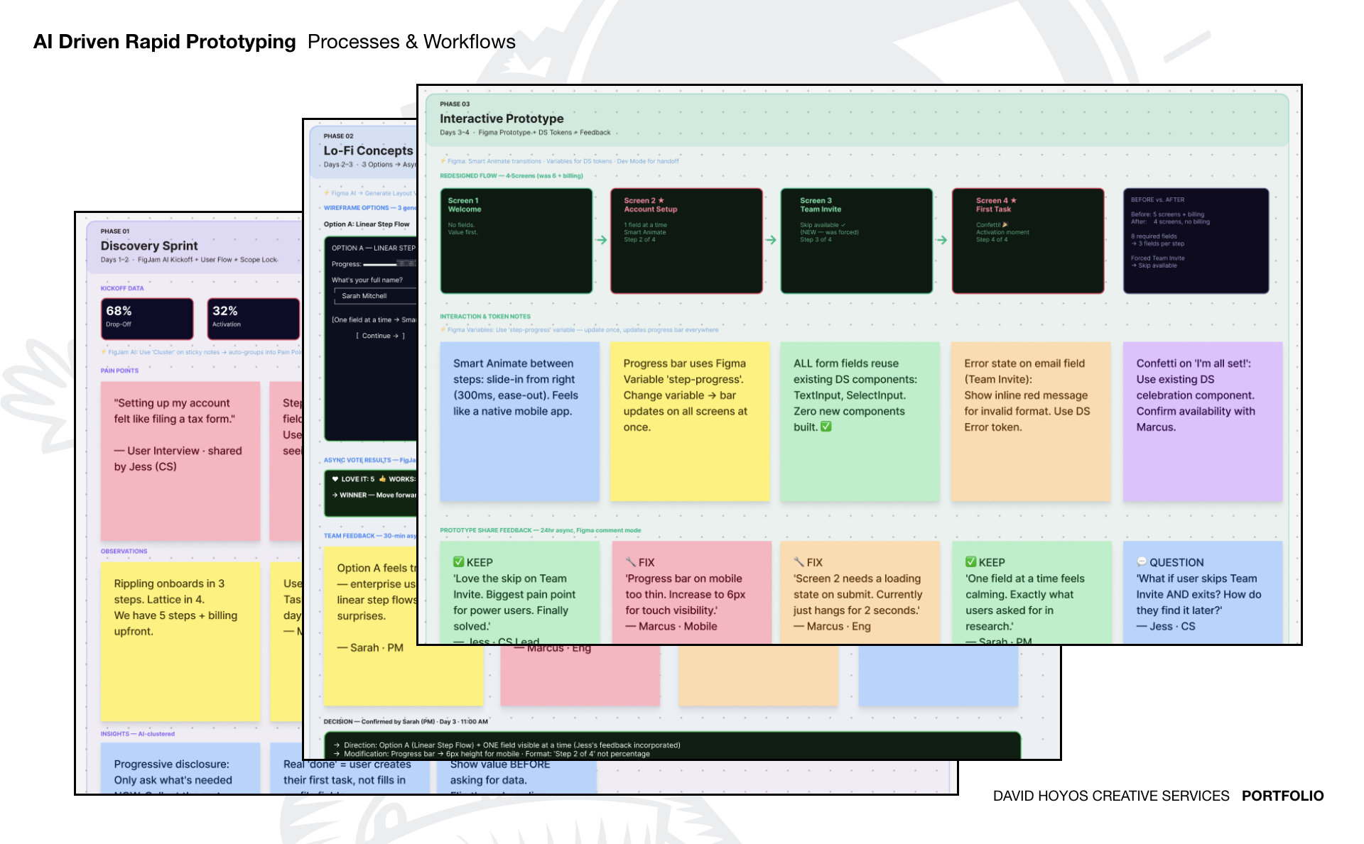
The sprint ran across four phases: Discovery, Lo-Fi Concepts, Interactive Prototype, and Iteration and Handoff.
Discovery locked the problem before any design work began. User interviews, support ticket analysis, and competitive benchmarking against Rippling and Lattice revealed the consistent pattern: too many fields too early, no sense of progress, and a forced step that served no functional purpose. Four decisions were locked and signed off by the PM and lead engineer on Day 1: reduce Account Setup to three fields, add a visible step counter, make Team Invite skippable, and redefine "done" as a user completing their first task rather than filling out a profile.
Exploration produced three structural wireframe options: a linear step flow, a single-page scroll, and a conversational interface. The team voted asynchronously using FigJam. Option A, the linear step flow, won decisively with five out of six team members choosing it, supported by clear reasoning: enterprise users trust predictable step flows, and the conversational approach read as too casual for B2B HR contexts. One piece of async feedback from the Customer Success lead, to show one field at a time rather than grouping all three, was incorporated before moving to prototype.
The Work
The redesigned flow reduced five screens to four by removing billing from the onboarding sequence entirely. Account Setup was rebuilt around one field at a time with Smart Animate transitions between steps, a progress bar labeled "Step 2 of 4," and a loading state on submit that had been missing from the original. Team Invite became skippable. First Task was framed as the activation moment, with a completion state to mark the transition from setup to actual use.
Every component used in the prototype was pulled from the existing design system with no new components built, keeping DS compliance at 100% and eliminating implementation risk for engineering.
The priority matrix run on Day 5 sorted all outstanding feedback into four quadrants. High-impact, low-effort fixes, including the progress bar thickness on mobile, the loading state, and the skip CTA, were completed within the sprint. Higher-effort items including the post-skip re-entry flow and full animation polish were documented and scoped for the next sprint cycle.
The engineering handoff package included Figma Dev Mode specs with full token mapping, component annotations linked to the DS library, a Figma Variables JSON export mapped to existing codebase variable names, annotated edge cases for error states and skip paths, and a 20-minute Loom walkthrough of every screen and interaction state.
The Outcome
Sign-off completed in one round. Handoff delivered by end of day five. Engineering fielded two post-handoff questions against a target of fewer than five. Fields per step reduced by 62%, from eight to three. The predicted activation improvement from the CS lead's estimate was 26%, with engineering build beginning in the following sprint.
The sprint retro surfaced one structural insight worth keeping: async FigJam review saved two hours of scheduled meetings, and the best design input of the sprint, the one-field-at-a-time change, came from an async comment rather than a live session.
Role — Fractional Design Lead Team — Product Manager · Lead Engineer · Customer Success Lead · Fractional Design Lead Platform Industries — B2B SaaS · Workforce Management · Series A
AI–Driven Rapid Prototyping
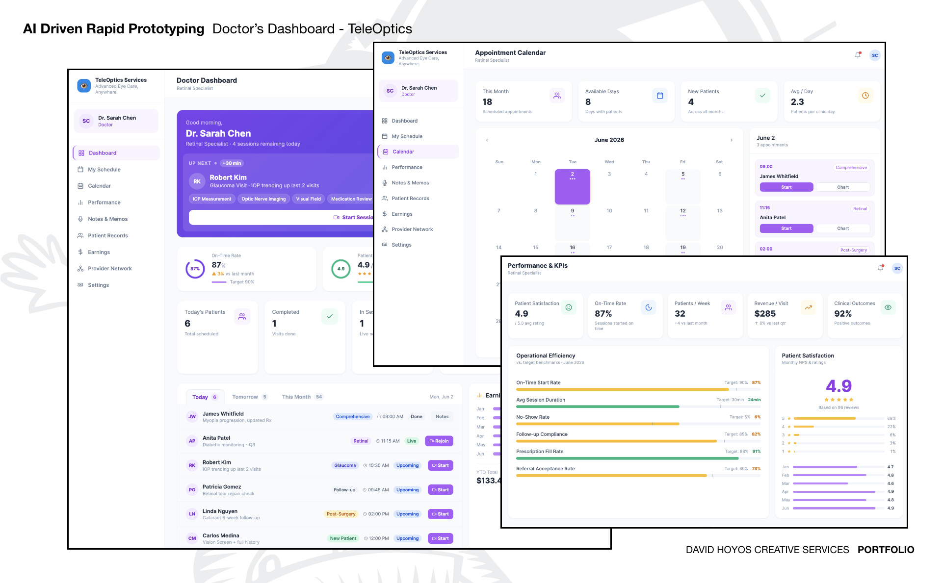
TeleOptics - Doctor's Dashboard
Overview
TeleOptics is building a network of remote eye care hubs in rural South America, connecting patients in underserved communities with certified ophthalmologists and optometrists through real-time telemedicine. The clinical model is straightforward: a trained technician at the local hub runs a portable device exam while a remote doctor reviews the results and conducts a live video consultation, then issues a prescription or referral before the patient leaves the room. The operational problem was that the doctors had no purpose-built interface to work from. Remote ophthalmologists managing six to ten hub sessions per day were tracking patient histories manually between calls, receiving device readings through WhatsApp, and context-switching between a basic video platform and handwritten session notes to manage a schedule that mixed Comprehensive visits, Retinal exams, Glaucoma follow-ups, and Post-Surgery checks across multiple hub locations simultaneously. Session overruns were common. Follow-up compliance was untracked. There was no performance visibility for either the doctor or the clinical operations team.
This was an AI-assisted rapid prototyping sprint to design and deliver a working Doctor's Dashboard, a four-panel command center giving remote ophthalmologists full situational awareness across their patient queue, appointment calendar, clinical performance, and earnings without breaking their attention during a live consultation.
The Challenge
The core design tension was information density versus real-time usability. A remote doctor handling 54 appointments across a month and six hub locations needs a substantial volume of data immediately accessible. Access to next patient, their condition and history, the session type, device exam tags from the technician, current on-time rate, no-show trends, and revenue per visit, but not all at the same moment, and never at the cost of the patient already on screen. Building a dashboard that answered every question was straightforward. Building one that answered the right question at the right moment in the working day was the actual problem.
Three constraints shaped every decision from the start. The interface had to work in a single viewport with no buried navigation, because a doctor checking the patient queue between sessions cannot absorb a secondary click hierarchy. Performance data had to be present without being dominant, because the dashboard serves clinicians managing a live schedule, not analysts reviewing a weekly report. And the prototype had to function as a direct engineering reference, with fully annotated states and no design-to-spec translation gap on handoff.
A fourth constraint surfaced during discovery: the information a doctor needs shifts materially across the working day. Pre-session preparation, live consultation, post-session documentation, and end-of-day performance review are four distinct mental modes with four distinct information priorities. Any architecture that treated them as a single undifferentiated surface would serve none of them well.
Approach
The sprint moved through three phases: Discovery and Architecture, Component Design, and High-Fidelity Prototype with Iteration.
Discovery did not begin with wireframes. It began by mapping the doctor's workday as a sequence of mental modes rather than as a feature inventory. That framing produced the navigation architecture directly and in the right order: Dashboard for session-ready situational awareness, Calendar for schedule management, Performance and KPIs for clinical outcomes review, Patient Records for longitudinal history. The sequence was not alphabetical or categorical — it followed the actual order in which a doctor moves through information between opening the app at 9:00 AM and closing the last session of the day.
AI accelerated the sprint across two phases without replacing the clinical judgment behind the decisions. In the architecture phase, it compressed component scaffolding and copy hierarchy decisions that would otherwise have consumed a half day of manual iteration. In the prototype phase, it generated edge-case states, empty schedule views, mid-session queue changes, post-surgery follow-up flags requiring elevated visual priority, faster than manual exploration allowed, which expanded documented state coverage in the final handoff without extending the timeline.
Two clinical decisions were locked before any high-fidelity work began. Patient condition summaries had to appear inline on the patient list rather than one click away, because a doctor scanning the queue before starting a session should not have to navigate to confirm what they already know. And every performance metric had to display the current reading against its target — 87% On-Time Rate against a 90% target, 6% No-Show Rate against a 5% target, 82% Follow-up Compliance against an 85% target, because a number without a benchmark gives a clinician no basis for self-correction in real time.
The Work
The Dashboard view opened with a direct morning greeting and the next patient front and center — name, condition, session type, and a countdown to session start, with the device exam tags the technician would be running surfaced as chips below the patient card. Today's total of six scheduled patients, one completed visit, and one live session in progress were rendered as a summary strip below the active card. A single tab switch exposed Tomorrow at five patients and This Month at 54.
The patient list carried the full clinical range of the working day inline on every row: Myopia progression with an updated Rx for James Whitfield, Diabetic monitoring at Q3 check-in for Anita Patel, Glaucoma with IOP trending upward across the last two visits for Robert Kim, Retinal tear repair check for Patricia Gomez, Cataract 8-week post-surgery follow-up for Linda Nguyen, and a new patient requiring Vision Screen and full history intake for Carlos Medina. Appointment type, timestamp, status indicator, and session action — Start, Rejoin, or Chart — were accessible on every row with no secondary navigation required.
The Calendar view surfaced the full month at a glance with appointment density marked on each date, and a same-screen appointment list for the selected day showing start time, patient name, appointment type, and a direct Start action. Four header metrics gave the doctor a scheduling read without opening any other view: 18 appointments scheduled this month, 8 available clinic days, 4 new patients, and 2.3 patients per clinic day on average.
The Performance and KPIs panel held five headline metrics with directional indicators: Patient Satisfaction at 4.9 out of 5.0 across 96 reviews, On-Time Rate at 87% against a 90% target, 32 Patients per Week up four from the prior month, Revenue per Visit at $285 up 8% quarter over quarter, and Clinical Outcomes at 92% positive. Below the headline metrics, Operational Efficiency rendered six benchmarked bars. On-Time Start Rate, Average Session Duration at 24 minutes against a 30-minute target, No-Show Rate, Follow-up Compliance, Prescription Fill Rate at 91% against an 88% target, and Referral Acceptance Rate, each plotted against its defined target. A monthly NPS trend and star-rating distribution ran alongside, showing the January-through-June rating arc with 4.9 as the current month. A YTD Earnings panel tracked cumulative revenue at $133.4K with a monthly bar chart for pace visibility.
All components were built from established design system conventions. No new patterns were introduced. Every screen state was annotated for engineering with interaction flows, empty states, and edge cases documented in full.
The OutcomeThe prototype was delivered as a fully interactive Figma file with annotated states, hover and click interactions, and edge case documentation covering empty schedules, live session interruptions, and elevated follow-up flags for post-surgery patients. Clinical and product stakeholders approved the information architecture in a single review session with two copy adjustments and no structural changes. The doctor workday framing, four mental modes sequenced into navigation rather than a feature list was adopted as the foundational mental model for all future TeleOptics provider-facing product decisions. Engineering estimated a 35% reduction in initial build scoping time because every screen state was explicitly documented and all components mapped directly to existing design system tokens with no translation work required.
The AI-assisted prototyping approach compressed what would have been a three-week design and iteration cycle into a single sprint while producing broader documented state coverage than a manual process would have delivered in the same window.
Role — Fractional Design Lead · AI-Assisted Rapid Prototyping Team — Founder · Clinical Advisor · Fractional Design Lead Platform Industries — Healthcare Technology · Telemedicine · Rural Health Equity · Latin America
Additional Samples...